
Saturday, 20 December 2014
Friday, 19 December 2014
Contents page
First Draft:

This is my first draft of my contents page, I like the layout of my contents page with the title going up the left side of the page. I think this is effective because the colour and font of the title stands out. I like the colour background as it clearly shows its a pop magazine and is interesting to girl viewers because of the colour. I chose to edit my photos with the same effect to make the photos look similar and I added a border around my three photos as it makes the photos look as they are polaroid's. Nowadays polaroid's are rising in popularity and a pop magazine needs to keep up to date.
However I didn't think the writing looks effective because I used the same basic font for it all and only used back font. I am going to improve this by using a different font for my sub-heading 'Inside this month...' and change the colour of the page number to make it stand out. I am also am going to change the three photos to one of Beth and then change the other two to go with the rest of the pages in the magazine e.g. a photo of Miley Cyrus or BBC music Awards or the Victoria Secret Show.
Second Draft:

This is my second draft of my contents page and I think I have improved from my first draft as it looks more realistic magazine. I changed the background and made it lighter because I think the first draft has a bright pink and took attention away front the rest of the contents page. I kept the same title as I liked but changed everything else except the layout of the page itself. I changed the second photo to the logo of the BBC Music Awards and then a photo of Miley Cyrus. I didn't change the border around the photos as I prefer it to no border.
I changed the font of the sub-heading to 'Amatics Small Caps' I like this font because I used it on my front cover and I'm using the same fonts as its my font family and they look best together. I changed the colour of most of the font to the same as the title and changed the page numbers to a red colour to make it easier for the reader to go a certain page. However I don't like the background for the writing because I think its slightly distracting and I would make it lighter. I need to double check the spelling of my writing and I didn't make the background big enough for all the writing as 'models' overlaps on the background of the contents page. I like the font 'Lobster Two' because I think it is readable and the font looks girly.
Final design:

I used the same colour background and title as my other drafts but I changed what I wrote for the page descriptions. I added different coloured rectangles behind the text to make it stand out and changed it to be on the left hand side. I used pastel colours because all pop magazines use bright and pastel colours. I used the same three photos from the 2nd draft but added a photo of the Victoria Secret show to shoe the reader what has been happening recently. I slightly alter the position of each of the photos and added a selection of the same love hearts that were on the front cover to decorate the page. I added a bright orange star and wrote 'See more photos inside!' this entices the reader to buy and read the magazine. I moved the sub heading 'Inside this month...' to the left and used black font and made it bigger to read easier.
Sunday, 14 December 2014
Front Cover- Final Design

I researched more on pop magazines and realised they use love hearts and star on their front cover therefore I added some hearts around the writing.

Saturday, 13 December 2014
Front Cover
First Draft
I chose to use this photo because I thought I could write around it easily. I edited the photo on 'Pic Monkey' and i changed the saturation and brightness to make the photo brighter and give it more colour because the original is a bit dull and grey. I used teeth whitening to brighter her teeth but it doesn't look very realistic and i added some blush boost to give the face more colour and tinted the lips. However i don't like how i have edited this first photo because it looks very fake but in the pop industry they over edit and airbrush the photos to make the person perfect looking.

Then I added text around the photo in particular a title and subheadings to make it look like a front cover. I used a font called 'Budmo Jiggler' which looks like a dressing room mirror light and I think it goes well with the 'Pop' genre because pop stars are in the public eye. I made a slogan which is 'Making Pop the new POP-ular!' and used 'Amatics small caps' in black because i wanted to make a font family. I then used 'Emily's Candy' for the rest of the writing and used three different colours to make certain parts stand out. I added a star shape in the bottom corner to show whats in the magazine. I like the idea but not the colour or font.
First Draft:

Second Draft:
I used the same font for my title as it suits the pop industry but changed to a darker purple and made it slightly bigger. I used a different photo because I thought the pose was more interesting and I rearranged the placing of the text. I moved the slogan next to my title as it fits better. I moved my issue date under the title as it is important to the reader to see what magazine to buy. On the left side of the front cover I have kept the same text but changed the font to 'Lobster Two' as I think it easier to read and goes better with the other fonts. I have changed the font of 'Beth Tierney' as it is the name of my model/singer and want it to stand out. I kept the same bar-code but added the date above it and the price and website below to give the reader more information about 'Emerge' magazine. Next to this I added a extra bubble compared to the first draft as it looked slightly empty and need more writing. I used the same font as the rest of it but changed two words 'Pop Music' to a different to make it stand out the same as the other piece of text. I changed the font colour to black as I made the background a light pink colour and need it to be easily readable. In the bottom right corner I added a similar star shape bubble as in the first draft but changed the colour to a purple. I changed the font to 'Lobster Two' and had it in white but the word 'Exclusive'in red to show it's important. I changed the text in the star to make it more enticing.


Thursday, 11 December 2014
Questionnaire
I surveyed 15 people in the age group of 13-20 to see what they thought I need to include in my pop magazine.
I am going to write the amount of people who voted for each option in red.
1. I am making a pop magazine, what colours should I use?- Pink and Purple (10 people)
- Blue and Pink (5 people)
- Blue and Green (0 people)
- Purple and green (0 people)
- Arianne Grande (3 people)
- Miley Cyrus (7 people)
- One Direction (3 people)
- Ella Henderson (2 people)
- Celebrity Gossip (7 people)
- Fashion (7 people)
- popular trends (1 person)
4. I have made my own singer called 'Beth Tierney' and I want to include a page about her, How do I write it?
- Article (3 people)
- Interview (12 people)
5. What particular thing should I include in fashion?
- Recent fashion shows (10 people)
- fashion trends (3 people)
- celebrities fashion sense (2 people)
6. What should I include when talking about music?
- chart hits (0 people)
- top music of the year (2 people)
- music awards show (13 people)
This helped me design and make my pop magazine because I wanted to know what my target audience wanted in my magazine to make it successful.
Initial Plan for My Magazine
These are my initial plans for my front cover, contents page and double page spread. Below are some of my own drawings showing the layout of the three different pages but when it comes to editing them I will adjust/alter it to make it look like a real magazine.
Front cover
.JPG)
Contents Page
.JPG)
Double Page Spread
.JPG)
My Model/Singer Bio


Wednesday, 10 December 2014
Slogan Idea
On the front cover, I wanted to add a slogan therefore i tried brainstorming ideas but found it hard to think of slogans. So i surveyed people in my media class and came up with better slogans that go with my genre. From the survey i got many different slogan names, for example:


- 'Livin' the Pop'
- 'Live and breathe Pop'
- 'Pop is the new POP-ular'
- Eat.Sleep.Breathe.Pop'
- 'All about that Pop'
- 'Making Pop the new POP-ular'
Most pop magazines directed at a younger audience,can come across slightly cheesy because they trying to promote everything what is in the magazine. This is why young pop magazines have a lot of images and writing and bright colours to make it eye catching for the reader when they go into shops like WHsmiths. In conclusion I decided to use the slogan 'Making Pop the new POP-ular' because my target audience is 15 to 25 therefore i didn't want to make it cheesy as the reader will think it isn't very cool and wouldn't buy it or read on. For example 'Livin' the Pop' is very predictable for slogans in magazines e.g.

I want my pop magazine to attract different audiences in the age group I have chosen instead of one group of people. I this comes across by saying 'Pop is the new POP-ular' because nowadays people are getting more attracted to indie rock bands and artist than pop music. However pop is mainstream music that is played on TV and radios therefore any genre of music could come under the 'Pop' genre. I'm trying to make my pop magazine appeal to a wider audience I am going to do this by including artists/bands that are popular at the moment to keep the audience up to date with the upcoming music.
Monday, 1 December 2014
Editing my photographs
I tried many different websites and apps including pixlr, fotor and pic monkey. I eventually found 'pic monkey' to be the easiest to edit my photos on without making it look over edited or not real. I have altered brightness,saturation,sharpness and many more. This is the difference between unedited and edited:


In the pop industry it is all about airbrushing and brightening photos to make the artist or band look perfect in a way and flawless. I like how the light shine on my models face I did this by having a spotlight on her and this highlights her face nicely. By editing my front cover photo i think it makes the make up look more effective and pretty to suit my music genre and this will attract girls in my target age group.
Friday, 28 November 2014
Risk Assessment/REECE
In the lead up to taking my pictures for my front cover, contents page and double page spread, i had to decide the locations. it was between an outdoor area or indoor area. The outdoor area was a field/forest near my house which has interesting trees and the autumnal leaves. However i didn't think this suited my music genre which is pop because I think this could suit more indie pop/rock. The indoor area is either in my bedroom or the green screen at school. I thought would be a good idea because i wanted to change the background colour but i decided in the end to do it in my bedroom because my walls are pink so i think it will compliment my music genre more because my magazine is mostly directed towards girls.I had my photo shoot in my bedroom and didn't want any health and safety hazard whilst taking photographs, I think there are less hazards inside than in outdoor conditions.
Risk 1:
Having loose wires on the floor could lead to my model tripping over and injuring herself.
How was it resolved?
I chose to take my photographs in front of a plain wall in my bedroom to act like a green screen. I made sure there were no wires near my model or myself neither on the floor or loosely hanging down.
Risk 2:
Having extreme temperatures whilst shooting e.g. outside conditions could lead to the model getting cold quickly and inside in front of many lights could hurt the model's eyes and the lights can create heat.
How was it resolved?
I had my photo shoot inside and had my bedroom light on as normal and a more direct bright light to make the effect look like a spotlight. I pointed the light over the model so she didn't have to look directly into the light. I also let my model rest whenever she felt slightly hot and a drink on hand.
Risk 3:
Having a electric sockets near the model could lead to a electric shock.
How was it resolved?
I didn't have any sockets turned on or near the set up area.
Risk 4:
Having furniture in the way so the model finds it claustrophobic.
How was it resolved?
I did have a photo frame up on my wall where I chose to take photos, therefore i took it down and took out the screws so the model would be safe in the area and won't have to be careful of the photo frame.I also moved my bed away from wall a bit more so i had enough room to take the photos and so i didn't have to balance on the bed to take the photographs.
My Original Photographs
Location?
I choose to have my photo shoot inside because most pop magazines have it in a professional studio so i thought i would try the same effect from a plain background. I took the photographs in my bedroom on one of my plain walls which is a pale pink colour. I think this will appeal to my target audience which is mainly woman.
Who did i take the photos of?
I captured the photos of my younger sister because she is 15 years old and my target audience is from 15 to 25 therefore i thought she fit the brief of a youthful pop magazine. I found it was hard to take pictures at school of my friends because we never time to do it. Therefore I thought my sister was the best option because i always see her and it meant i could take longer on the hair, makeup, clothing and the photo shoot itself.
Clothing?
My model wore a plain peach/pink coloured top because i didn't want it to be the main attention of the photograph.
The way i captured my photographs?
I chose to only take close up photographs because in a variety of pop magazines i have saw they usually have a head shot on the front page, so the main attention is of the singer/band.
My set up?
My set up was in my bedroom on a plain pink wall and I used a bright light in the photo shoot but directed down over the model because i think it made the pictures look more professional.


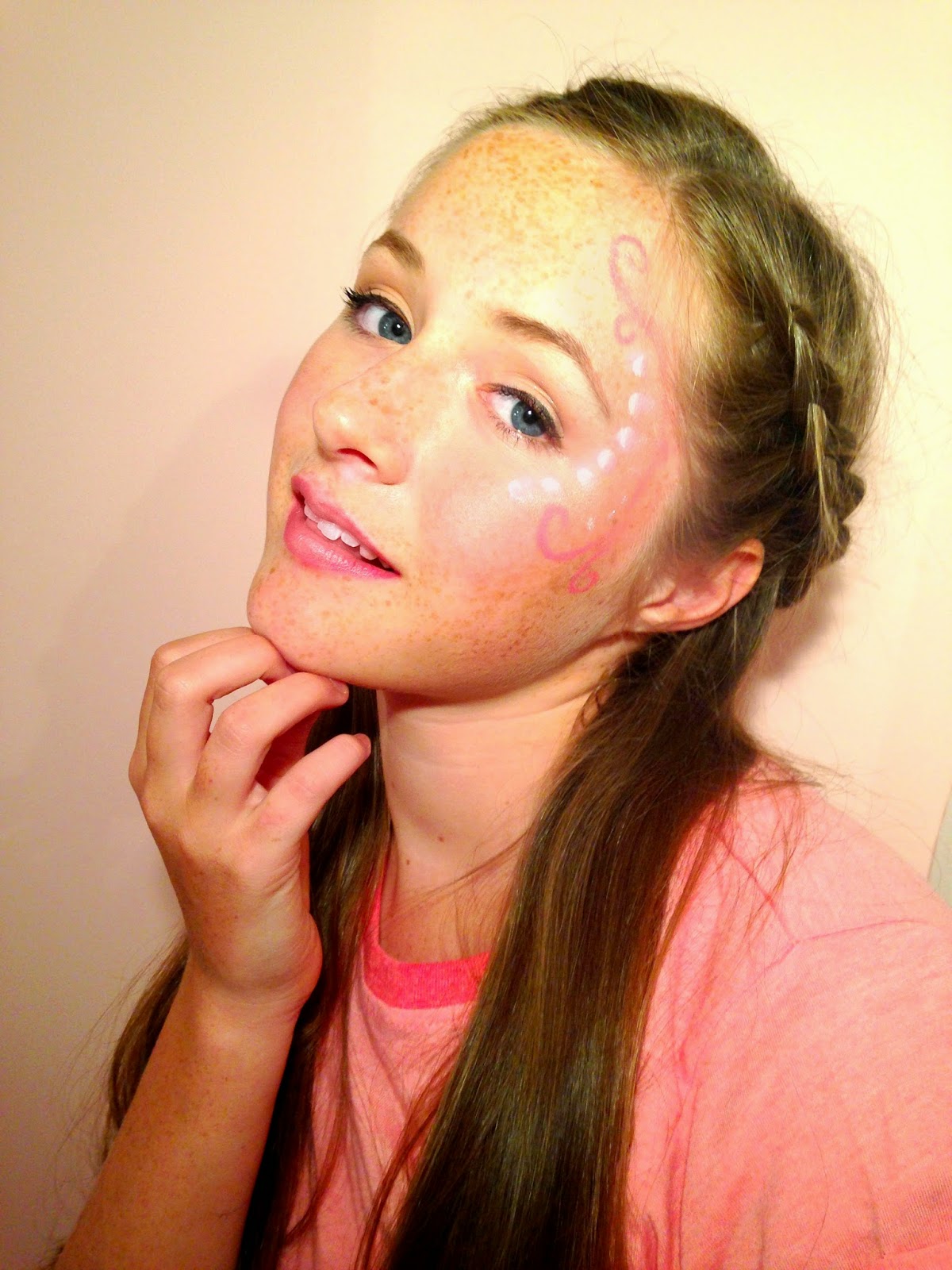
Hair and Makeup?
For hair she had a braid at the front of her head to keep the hair out her face and it looks nice and will set a fashion trend. For makeup i kept the face quite simple and natural because my sister has freckles and i didn't want to cover them. I think it is different to see someone with freckles on a pop magazine because usually they have quite plain flawless faces therefore it makes my model stand out and be unique. On the right side of the face i decided to try some face paint to make the photograph more interesting. I used the colours pink and white and added silver glitter, i think this looked very effective on camera. On the lips I used a bright pink and added some of the silver glitter in the middle of the lips so the light reflects off it.Here is a picture of the hair and makeup:

Photographs from the Photo Shoot:
I chose the photo below as my front cover (main image) because i think it is the most effective. i like how she is not looking directly at the camera because it goes against other pop magazines that I have taken inspiration from and makes it look more unique. My model has her arm over her head I think this is a abstract and not a predictive pop pose therefore i think it goes against some pop conventions but i want to make my magazine stand out.
I used the 4 photos below on my double page spread because they were all very different because she was posing different with a different facial expression. These photos are very clear and good quality and go together really well.


The photos I didn't use:
I didn't use the first photos because the quality wasn't as good as the others above and I didn't think the pose and facial expression portrayed pop. The second photo didn't have very good lighting and had a different background and I wanted all the photos to have the same background. The last photo was a good photo but the light hit her face weirdly and I didn't like the effect it made. The lighting on this photos was too light and wouldn't fit in with the other photos.


Equipment for my Photographs


I decided to use my iPhone 5c instead of the cameras at school because I was planning on taking the photographs in my own time and not in lesson times because I wanted to concentrate on research. I found it easier to focus the camera on my iPhone and transport to my computer than taking it on a camera.
I have edited my photographs in different ways, therefore I have a variety to choose from when it comes to making my front cover, contents page and double page spread. However I found it hard to transfer my photos from my iPhone to my computer without it going blurry.I tried editing my photos on 'Pixlr' but when i zoomed into my pictures they would go very blurry therefore i found it hard to edit a small photo and i found when editing the photos the effects were very over the top even though in the pop industry they over airbrush photos. Overall I found it difficult to edit my photos using 'Pixlr'.
Therefore i tried a different website called 'Pic Monkey' and found it easier to transfer my photos to drop box than my computer. I found it easier to alter the effects, brightness and airbrush without it changing my models face to much. I also can add titles, sub-headings and other writing to create my front cover, contents page and double page spread.
Monday, 24 November 2014
Intertextuality
We live in a post modern era where everything has been done before and we recycle the same ideas over and over again. There are clear recycled bands and artists in the music industry, for example in the rock and roll genre the 'Beatles' and 'Oasis':

Similarities between the two bands:
- haircut/style
- facial expressions in photos
- clothing
- the amount of people in the band
- both wear black and white.
- sunglasses
In the pop genre there was a similarity 'Madonna' and 'Lady Gaga':
- Similarities between the pop artists:
 blonde hair
- iconic hairstyles
- unique costumes
- makeup
- similar body shape
- music- catchy,repeative,high-pitched
Oppositional ReadingIn magazines the audience can feel it is gossip, not trusted and can be rejected for culture and political. For example 'LARD' magazine was full of photos of dead bodies and isn't very interesting to read about. On the front of the 'Beatles' American Album cover they posed in a butchers with meat on them and are smiling happily, this was at the time of war so was not the best timing.- Visual Motifs is something you see recurring for example in the pop industry many woman are into the new craze of 'twerking' and songs about 'butts'.
- Hyper Real photos are used in pop magazines than the reality. They over edit images to make it look different and to what they want e.g. skinny and more tanned. In rock magazines like authentic and real photos.
- R&B genre doesn't care about the authentic look and tries to make it look unique by using cartoons and manga styles.
Analysis of Double Page Spread of Billboard
Billboard Magazine

- The main image: only takes up half the page not spread over the double page spread. This is an abstract way to focus of the spread is the image, in Billboard magazine they always focus on one artist this gives the magazine a lot of room for the text. Having Beyoncé on half the page gives the artist all the attention on her and her music. She is looking directly at the camera with a dull facial expression on her face this can relate to her being described as 'Fiercely' in the headline. A metal cage is covering half of her face this can represent her fierce personality and makes the reader interested in the artist.
- The Headline: it is 'Fiercely Creative' this is associated with her being a strong independent woman. The of the headline is large because it grabs attention and persuades the audience to read the article.
- The By-line: contrasts against the background colours to make it clear to read for the audience. The by-line tells you who wrote the article.
- The Stand: is at the beginning of the article which gives the reader information about the artist and article. The stand sets the scene fro the article because it tells you hat they have done. It also summarises the article in one sentence therefore it is a short overview. It tells us that Beyoncé was announced by Billboard 'Woman of the Year' this is an important award to the magazine and change the colour of the text so it stands out.
- The background: is not a block colour it goes from a bright purple to a grey (gradient effect). I think purple is a strong female colour and shows she is a strong female and gets across the fierceness.
Tuesday, 18 November 2014
'Billboard' Magazine

'We love Pop' Magazine

However I don't want to concentrate my audience on younger children and teenagers. I want it to be related to issues and ideas for older teens e.g. 16 to 20 years. Because I feel there is a gap in the market between kids and adults therefore I want my magazine to fill the market.
'Top of the Pops' Magazine
I have decided to base my music magazine on the music genre pop. I chose the pop genre because I listen to most popular the charts. There is many different pop magazines targeted at different audiences.
 For example 'Top of the Pops' has a target audience of young people especially girls you can this from the colour scheme. The magazine has chosen pink as its main colour this entices young girls and makes the magazine look 'pretty'. They have put issues which happen to the younger audience and want to make people more aware e.g. bullying. In big font it says "Bullies made me stronger" this is to show young girls that even celebrities go through bullying therefore it makes the audience feel no longer alone. The pop magazine also says about fashion to give another reason why should buy the magazine for fashion tips and advice.
Monday, 17 November 2014
Media Institutions
-
IPC media was founded in 1968 and owned by 'Times Inc.' and has a head quarters in London.IPC stands for 'International Publishing Corporation'.
- IPC Media Music magazines are dedicated to music and music cultures featuring many different famous musicians, but also new musicians that specialize in certain types of music.
- IPC Media- one of the UK's leading consumer magazine and digital publishers, selling over 350 million copies per year.
- IPC company owns the music magazines NME and Guitar and Bass.
- Five magazine divisions:
- Inspire (leisure and specialist)
- Ignite! (men's lifestyle and entertainment)
-Southbank (woman's lifestyle and entertainment)
-TX (television titles)
Large Publishing Houses
Hearst Corporation is one of the nation’s largest diversified media and information companies. It has a majority of interests e.g. 'San Antonio Express-News', 'Good Housekeeping', 'Cosmopolitan' and 'ELLE'. They also own leading TV networks for example 'Lifetime','A&E' and 'HISTORY'.
As I am making a Pop magazine for teenagers I wanted to research where different young pop magazines are published, to see which is best suited.
- 'Top of the Pop's' magazine is published by Immediate Media Company and aired a TV show for the magazine but it was cancelled in 2006. They don't just publish music magazines they cooperate with BBC and sell there magazines such as BBC history and BBC wildlife. They publish preschool magazines, educational magazines and preteen magazines. It is a UK based Company and started in 2011.
- 'We love Pop' magazine is published by Egmont Company in which they publish magazines and books for babies to teens. They also publish 'Go girl' another teen pop magazine. I wouldn't choose this publishing company for my magazine as my magazine is for a slightly older audience.
- 'Billboard' magazine is owned by 'Prometheus Global Media' and is an American company. They sell entertainment blogs, TV shows and magazines. I wouldn't use this company as it is not UK based and publishes a big variety of media.
Wednesday, 12 November 2014
Target Audience
I think my pop magazine called 'Emerge' is targeted to teenagers within the ages of 13-20. I think more females would be more interesting in reading my magazine. I think the typical audience will have interests in fashion, pop music and celebrities. I don't want to make my magazine expensive therefore not everyone can afford to read it. I have chosen this audience group because I feel like there is a gap in the market for pop music magazines especially for teenagers (that are not too childish). There are pop magazines for kids e.g. 'Top of the Pop's' and 'We (love heart) Pop'. I want to make my magazine easily readable therefore I am going to think about what fonts I am going to use. I am also going to make my photographs appealing to teenagers so I am going to choose a model who fits in the target audience.
Sunday, 9 November 2014
Focus group
In class we got put into groups of 3 or 4 to make a focus group to help us improve our ideas with other peoples opinions on your music magazine. I showed my focus group the mood board I made on Pinterest which included inspirations and some pop artists.
Title:
At the time of the focus group I had only just surveyed names therefore I thought I'd ask for there favourite and 3 out of 4 of the people in my focus group preferred the name 'Emerge' therefore I have came to conclusion to use that name.
Front cover:
I have only got a brief idea of what I want my front cover page to look like. I explained to my focus group that I want my front cover to have only want one singer/artist because I have researched other pop magazines and mostly all of them have one artist on the cover therefore they talk more in detail about that one singer. I want to take photos quite close up of the face than a head to toe photo.
Double page spread:
I haven't got a lot of ideas for the double page spread so I asked my focus group for opinions and ideas for what to put in a pop magazine which is targeted to teenagers not children. The ideas they gave me were:
- interview with a singer.
- issues in a singers life.
- talk about a singer's achievements.
- write about a award show e.g. Billboard Music Awards.
From the focus group I have more of an idea what will be on the double page spread I want a larger photograph of the singer, a large title with their name and a article. I don't want the article to be to long, I want it to be a bit more straight to the point and this will engage the reader to read the whole article than get bored half way through.
Subscribe to:
Comments (Atom)