First Draft
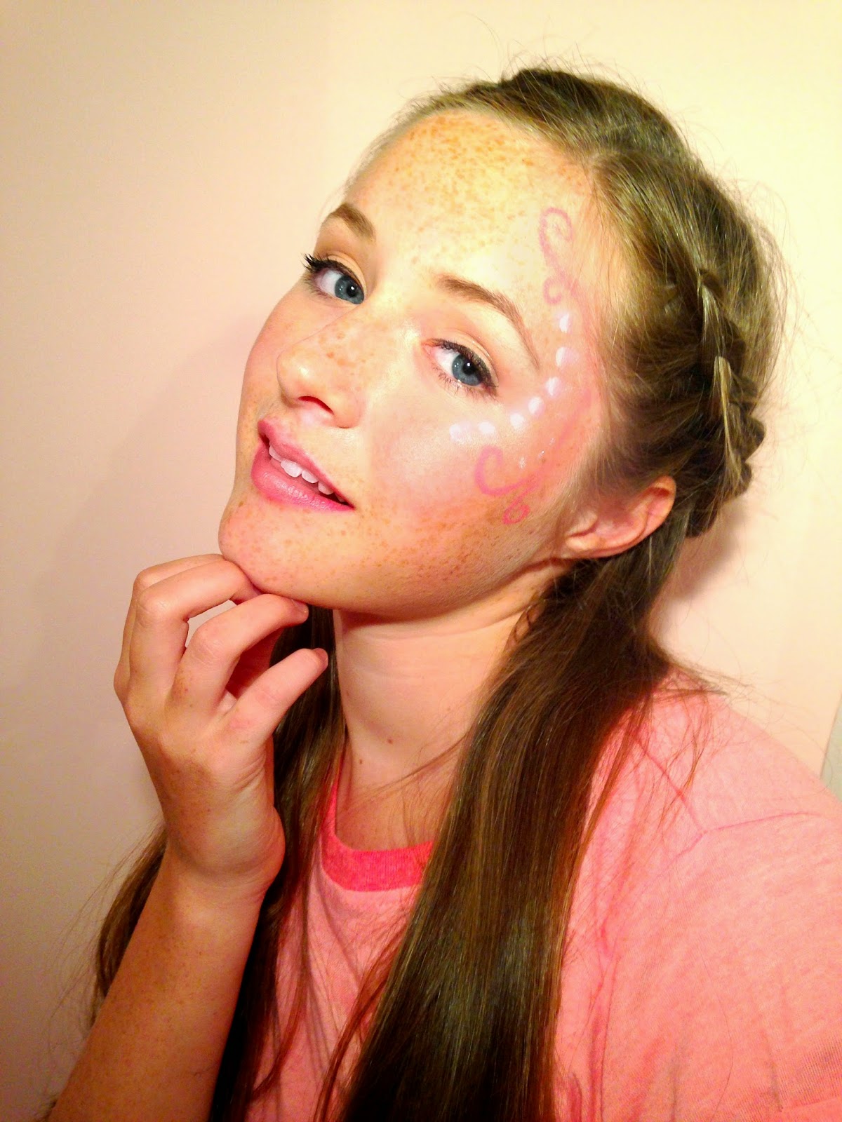
I chose to use this photo because I thought I could write around it easily. I edited the photo on 'Pic Monkey' and i changed the saturation and brightness to make the photo brighter and give it more colour because the original is a bit dull and grey. I used teeth whitening to brighter her teeth but it doesn't look very realistic and i added some blush boost to give the face more colour and tinted the lips. However i don't like how i have edited this first photo because it looks very fake but in the pop industry they over edit and airbrush the photos to make the person perfect looking.

Then I added text around the photo in particular a title and subheadings to make it look like a front cover. I used a font called 'Budmo Jiggler' which looks like a dressing room mirror light and I think it goes well with the 'Pop' genre because pop stars are in the public eye. I made a slogan which is 'Making Pop the new POP-ular!' and used 'Amatics small caps' in black because i wanted to make a font family. I then used 'Emily's Candy' for the rest of the writing and used three different colours to make certain parts stand out. I added a star shape in the bottom corner to show whats in the magazine. I like the idea but not the colour or font.
First Draft:

Second Draft:
I used the same font for my title as it suits the pop industry but changed to a darker purple and made it slightly bigger. I used a different photo because I thought the pose was more interesting and I rearranged the placing of the text. I moved the slogan next to my title as it fits better. I moved my issue date under the title as it is important to the reader to see what magazine to buy. On the left side of the front cover I have kept the same text but changed the font to 'Lobster Two' as I think it easier to read and goes better with the other fonts. I have changed the font of 'Beth Tierney' as it is the name of my model/singer and want it to stand out. I kept the same bar-code but added the date above it and the price and website below to give the reader more information about 'Emerge' magazine. Next to this I added a extra bubble compared to the first draft as it looked slightly empty and need more writing. I used the same font as the rest of it but changed two words 'Pop Music' to a different to make it stand out the same as the other piece of text. I changed the font colour to black as I made the background a light pink colour and need it to be easily readable. In the bottom right corner I added a similar star shape bubble as in the first draft but changed the colour to a purple. I changed the font to 'Lobster Two' and had it in white but the word 'Exclusive'in red to show it's important. I changed the text in the star to make it more enticing.


No comments:
Post a Comment