
Saturday, 20 December 2014
Friday, 19 December 2014
Contents page
First Draft:

This is my first draft of my contents page, I like the layout of my contents page with the title going up the left side of the page. I think this is effective because the colour and font of the title stands out. I like the colour background as it clearly shows its a pop magazine and is interesting to girl viewers because of the colour. I chose to edit my photos with the same effect to make the photos look similar and I added a border around my three photos as it makes the photos look as they are polaroid's. Nowadays polaroid's are rising in popularity and a pop magazine needs to keep up to date.
However I didn't think the writing looks effective because I used the same basic font for it all and only used back font. I am going to improve this by using a different font for my sub-heading 'Inside this month...' and change the colour of the page number to make it stand out. I am also am going to change the three photos to one of Beth and then change the other two to go with the rest of the pages in the magazine e.g. a photo of Miley Cyrus or BBC music Awards or the Victoria Secret Show.
Second Draft:

This is my second draft of my contents page and I think I have improved from my first draft as it looks more realistic magazine. I changed the background and made it lighter because I think the first draft has a bright pink and took attention away front the rest of the contents page. I kept the same title as I liked but changed everything else except the layout of the page itself. I changed the second photo to the logo of the BBC Music Awards and then a photo of Miley Cyrus. I didn't change the border around the photos as I prefer it to no border.
I changed the font of the sub-heading to 'Amatics Small Caps' I like this font because I used it on my front cover and I'm using the same fonts as its my font family and they look best together. I changed the colour of most of the font to the same as the title and changed the page numbers to a red colour to make it easier for the reader to go a certain page. However I don't like the background for the writing because I think its slightly distracting and I would make it lighter. I need to double check the spelling of my writing and I didn't make the background big enough for all the writing as 'models' overlaps on the background of the contents page. I like the font 'Lobster Two' because I think it is readable and the font looks girly.
Final design:

I used the same colour background and title as my other drafts but I changed what I wrote for the page descriptions. I added different coloured rectangles behind the text to make it stand out and changed it to be on the left hand side. I used pastel colours because all pop magazines use bright and pastel colours. I used the same three photos from the 2nd draft but added a photo of the Victoria Secret show to shoe the reader what has been happening recently. I slightly alter the position of each of the photos and added a selection of the same love hearts that were on the front cover to decorate the page. I added a bright orange star and wrote 'See more photos inside!' this entices the reader to buy and read the magazine. I moved the sub heading 'Inside this month...' to the left and used black font and made it bigger to read easier.
Sunday, 14 December 2014
Front Cover- Final Design

I researched more on pop magazines and realised they use love hearts and star on their front cover therefore I added some hearts around the writing.

Saturday, 13 December 2014
Front Cover
First Draft
I chose to use this photo because I thought I could write around it easily. I edited the photo on 'Pic Monkey' and i changed the saturation and brightness to make the photo brighter and give it more colour because the original is a bit dull and grey. I used teeth whitening to brighter her teeth but it doesn't look very realistic and i added some blush boost to give the face more colour and tinted the lips. However i don't like how i have edited this first photo because it looks very fake but in the pop industry they over edit and airbrush the photos to make the person perfect looking.
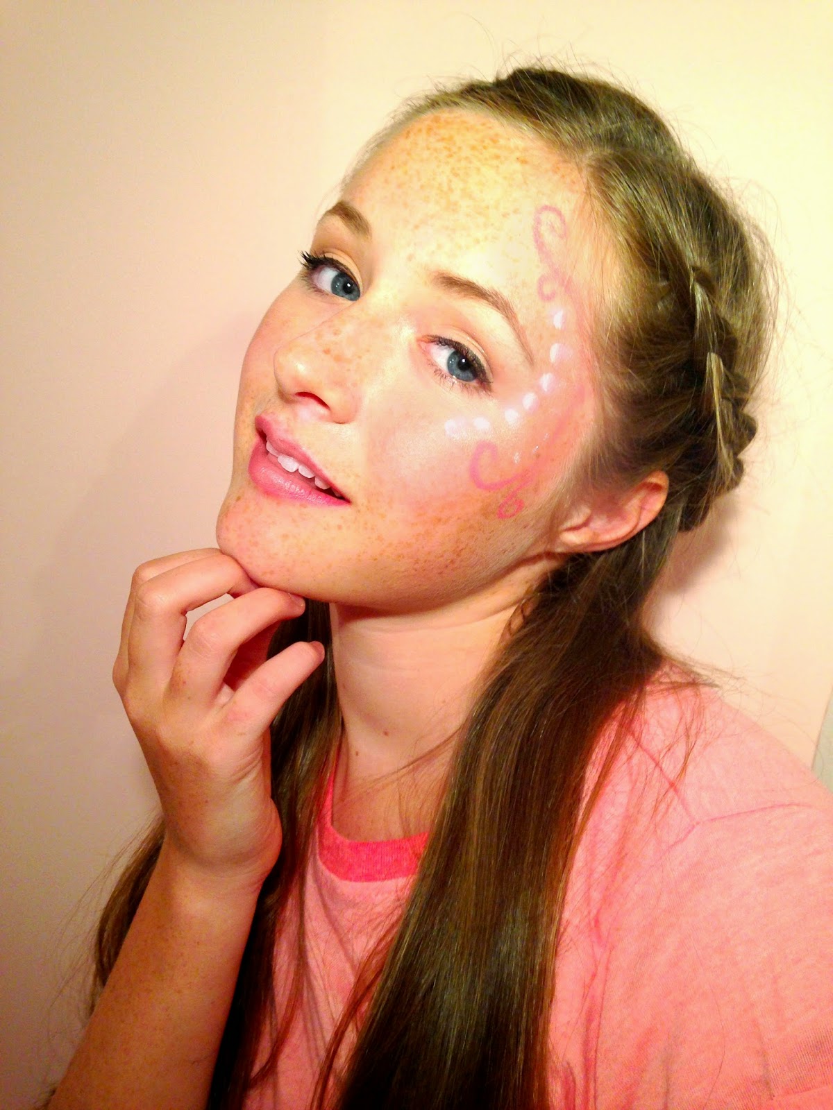

Then I added text around the photo in particular a title and subheadings to make it look like a front cover. I used a font called 'Budmo Jiggler' which looks like a dressing room mirror light and I think it goes well with the 'Pop' genre because pop stars are in the public eye. I made a slogan which is 'Making Pop the new POP-ular!' and used 'Amatics small caps' in black because i wanted to make a font family. I then used 'Emily's Candy' for the rest of the writing and used three different colours to make certain parts stand out. I added a star shape in the bottom corner to show whats in the magazine. I like the idea but not the colour or font.
First Draft:

Second Draft:
I used the same font for my title as it suits the pop industry but changed to a darker purple and made it slightly bigger. I used a different photo because I thought the pose was more interesting and I rearranged the placing of the text. I moved the slogan next to my title as it fits better. I moved my issue date under the title as it is important to the reader to see what magazine to buy. On the left side of the front cover I have kept the same text but changed the font to 'Lobster Two' as I think it easier to read and goes better with the other fonts. I have changed the font of 'Beth Tierney' as it is the name of my model/singer and want it to stand out. I kept the same bar-code but added the date above it and the price and website below to give the reader more information about 'Emerge' magazine. Next to this I added a extra bubble compared to the first draft as it looked slightly empty and need more writing. I used the same font as the rest of it but changed two words 'Pop Music' to a different to make it stand out the same as the other piece of text. I changed the font colour to black as I made the background a light pink colour and need it to be easily readable. In the bottom right corner I added a similar star shape bubble as in the first draft but changed the colour to a purple. I changed the font to 'Lobster Two' and had it in white but the word 'Exclusive'in red to show it's important. I changed the text in the star to make it more enticing.


Thursday, 11 December 2014
Questionnaire
I surveyed 15 people in the age group of 13-20 to see what they thought I need to include in my pop magazine.
I am going to write the amount of people who voted for each option in red.
1. I am making a pop magazine, what colours should I use?- Pink and Purple (10 people)
- Blue and Pink (5 people)
- Blue and Green (0 people)
- Purple and green (0 people)
- Arianne Grande (3 people)
- Miley Cyrus (7 people)
- One Direction (3 people)
- Ella Henderson (2 people)
- Celebrity Gossip (7 people)
- Fashion (7 people)
- popular trends (1 person)
4. I have made my own singer called 'Beth Tierney' and I want to include a page about her, How do I write it?
- Article (3 people)
- Interview (12 people)
5. What particular thing should I include in fashion?
- Recent fashion shows (10 people)
- fashion trends (3 people)
- celebrities fashion sense (2 people)
6. What should I include when talking about music?
- chart hits (0 people)
- top music of the year (2 people)
- music awards show (13 people)
This helped me design and make my pop magazine because I wanted to know what my target audience wanted in my magazine to make it successful.
Initial Plan for My Magazine
These are my initial plans for my front cover, contents page and double page spread. Below are some of my own drawings showing the layout of the three different pages but when it comes to editing them I will adjust/alter it to make it look like a real magazine.
Front cover
.JPG)
Contents Page
.JPG)
Double Page Spread
.JPG)
My Model/Singer Bio


Wednesday, 10 December 2014
Slogan Idea
On the front cover, I wanted to add a slogan therefore i tried brainstorming ideas but found it hard to think of slogans. So i surveyed people in my media class and came up with better slogans that go with my genre. From the survey i got many different slogan names, for example:


- 'Livin' the Pop'
- 'Live and breathe Pop'
- 'Pop is the new POP-ular'
- Eat.Sleep.Breathe.Pop'
- 'All about that Pop'
- 'Making Pop the new POP-ular'
Most pop magazines directed at a younger audience,can come across slightly cheesy because they trying to promote everything what is in the magazine. This is why young pop magazines have a lot of images and writing and bright colours to make it eye catching for the reader when they go into shops like WHsmiths. In conclusion I decided to use the slogan 'Making Pop the new POP-ular' because my target audience is 15 to 25 therefore i didn't want to make it cheesy as the reader will think it isn't very cool and wouldn't buy it or read on. For example 'Livin' the Pop' is very predictable for slogans in magazines e.g.

I want my pop magazine to attract different audiences in the age group I have chosen instead of one group of people. I this comes across by saying 'Pop is the new POP-ular' because nowadays people are getting more attracted to indie rock bands and artist than pop music. However pop is mainstream music that is played on TV and radios therefore any genre of music could come under the 'Pop' genre. I'm trying to make my pop magazine appeal to a wider audience I am going to do this by including artists/bands that are popular at the moment to keep the audience up to date with the upcoming music.
Monday, 1 December 2014
Editing my photographs
I tried many different websites and apps including pixlr, fotor and pic monkey. I eventually found 'pic monkey' to be the easiest to edit my photos on without making it look over edited or not real. I have altered brightness,saturation,sharpness and many more. This is the difference between unedited and edited:


In the pop industry it is all about airbrushing and brightening photos to make the artist or band look perfect in a way and flawless. I like how the light shine on my models face I did this by having a spotlight on her and this highlights her face nicely. By editing my front cover photo i think it makes the make up look more effective and pretty to suit my music genre and this will attract girls in my target age group.
Subscribe to:
Comments (Atom)