
Sunday, 18 January 2015


Evaluation 7: Looking back at my preliminary task, what do I feel I have learnt in the progression form it to the full product?
Here is my preliminary task, what I made at the start of the course and I am going to say how and what I improved on and compare it to my 'Emerge' magazine.
.JPG&container=blogger&gadget=a&rewriteMime=image%2F*)

Front cover:

Front cover:
There is a clear difference in picture quality from both front covers. My second front cover looks much more clear and easy to read the text. After making my school magazines I learnt the conventions of a magazine and this helped me improve it. On my preliminary task I made a magazine for school but looking back on it, I think I chose the wrong font as it hard to read and can loose the audience's attention. I prefer my colour scheme on my 'Emerge' magazine as it portrays a pop music magazine very well. Looking back on my prelim task front cover I am questioning why I chose green because the school colour' is red and red is so much brighter and fun. I do not like the layout of the first front cover as there are to many blank spaces and it makes it more obvious as the background colour is white, which isn't effective. I thought the title on my prelim task was clever because i used an '@' sign as it can be a title and a link to there social media pages. I think to improve the prelim task I would add even more photographs of the students at school to show other schools and people what there missing out on.
I could have overlapped small photos on my 'Emerge' front cover to spread out the text. I added different coloured lines on my school front cover to fill in the spaces. I did the same on my final front cover but added love hearts as it went with the pop theme and made the page more interesting. I decided to use one main image on my 'Emerge' front cover as I didn't think a white background looked realistic. As I had a deadline for my preliminary task I didn't have enough time to add a bar code to the front cover to make it look more real. I made the first front cover on the iMac's at school and fond it hard to transfer my photos from my phone to the iMac. Therefore for my final magazine I made it all on a laptop and used drop box to save all my photos so I could work at home and school. i made the font bigger on my Music magazine because looking back on the other task I can't actually read any of text in the green squares.
I could have overlapped small photos on my 'Emerge' front cover to spread out the text. I added different coloured lines on my school front cover to fill in the spaces. I did the same on my final front cover but added love hearts as it went with the pop theme and made the page more interesting. I decided to use one main image on my 'Emerge' front cover as I didn't think a white background looked realistic. As I had a deadline for my preliminary task I didn't have enough time to add a bar code to the front cover to make it look more real. I made the first front cover on the iMac's at school and fond it hard to transfer my photos from my phone to the iMac. Therefore for my final magazine I made it all on a laptop and used drop box to save all my photos so I could work at home and school. i made the font bigger on my Music magazine because looking back on the other task I can't actually read any of text in the green squares.
Contents Page:
I think there is an equal amount of improvements between my front covers and contents pages. I have used a similar layout on my final contents page but moved the title to the side to challenge the stereotypical conventions of a pop magazine. I added another title 'Inside this Month...' because it tells the audience that this is a monthly magazine. My second contents page shows off my editing skills because the preliminary task is very basic and childish. I added a similar star to my final contents page because they make the page look more interesting and makes certain parts of the text stand out. I think adding a frame around the picture makes it look more professional and a more realistic magazine. I think I wrote to many page descriptions compared to the amount of photos.
Therefore on my final contents page I added 4 photos with 4 page descriptions. Overall I think my final magazine is ten times better than my preliminary task because of the choice of colour, font, decorations and the editing software. I didn't have a lot of time to make my preliminary task therefore I rushed it when writing the page descriptions. My photos are much more lighter in the final design because I couldn't see the photos very well on the preliminary task. I have improved my final designs by changing the layout and font to see what looks the most effective and realistic.
Evaluation 5: What kind of media institution might distribute my media product and why?
When creating any sort of media product, there is always the tough decision of deciding whether to aim towards a mass audience or a niche target audience.
- "The mass market is a general business term describing the largest group of consumers for a specified industry product.
- "A niche market is the subset of the market on which a specific product is focusing. So the market niche defines the specific product features aimed at satisfying specific market needs, as well as the price range, production quality and the demographics that is intended to impact. It is also a small market segment."
As my magazine is based on the pop genre,therefore I decided to go with a mass audience as pop is a big genre compared to something like country music. I researched many different pop magazines and there publishing houses. I made a post earlier on before making my magazine about 'Media Institutions' but never chose a publisher.
I have narrowed it down to two different publishing houses, 'Bauer Media' or 'IPC Media' which both sell mainstream music magazines.Bauer Media concentrates on publishing magazines and on radio. I is one of the most successful companies in the worlds and is European based company. They own magazines like 'Q', 'Kerrang' and 'MOJO' which are popular all over the world. The company does this by having offices around the UK to sell popular UK magazines and air radio shows. They also have a Bauer group in the USA and this makes there radio and magazine products have a wider audience as they are available in 16 countries. Bauer publishes 'woman's weekly', 'Take a break', 'Eat in' and Puzzle magazines. This hows they offer a variety of different types of magazines,not just music.
IPC Media is a British Magazine Company and have three divisions of magazines. The first section is targeted towards woman which include magazines like 'Now and 'Pick me up'. Then the second section is more specific and is aimed at up market (upper class ABC1) which include 'Ideal Home' and 'Look' and these magazines are very popular. The last division is targeted to men which are magazines like 'Country Life' and 'Rugby World'. All the magazines owned by IPC are available on every platform e.g. mobile, tablet and print which widens their audience.They own 'NME' a very famous rock/pop music magazine and now is available to read online which brings in money which is a clever idea. IPC are not afraid to branch off into different music genres such as 'Hip Hop' and 'Brit pop' which are not as mainstream.
In conclusion I have decided it use IPC media company a my publishing house because they concentrate on just magazines making my magazine more likely to become popular. As My magazine is UK based it wouldn't make sense to use a company which isn't founded in the UK but IPC was founded in London. IPC company own some of the most popular magazines for woman, men and music. They offer different types of magazines at different prices to attract all social groups.Bauer media company do not concentrate on magazines in music which isn't good for my pop magazine as I need to be in the same publishing house as other popular music magazines. As IPC offer their magazines on all platforms it opens my magazines audience making it accessible to everyone.
I have narrowed it down to two different publishing houses, 'Bauer Media' or 'IPC Media' which both sell mainstream music magazines.Bauer Media concentrates on publishing magazines and on radio. I is one of the most successful companies in the worlds and is European based company. They own magazines like 'Q', 'Kerrang' and 'MOJO' which are popular all over the world. The company does this by having offices around the UK to sell popular UK magazines and air radio shows. They also have a Bauer group in the USA and this makes there radio and magazine products have a wider audience as they are available in 16 countries. Bauer publishes 'woman's weekly', 'Take a break', 'Eat in' and Puzzle magazines. This hows they offer a variety of different types of magazines,not just music.
IPC Media is a British Magazine Company and have three divisions of magazines. The first section is targeted towards woman which include magazines like 'Now and 'Pick me up'. Then the second section is more specific and is aimed at up market (upper class ABC1) which include 'Ideal Home' and 'Look' and these magazines are very popular. The last division is targeted to men which are magazines like 'Country Life' and 'Rugby World'. All the magazines owned by IPC are available on every platform e.g. mobile, tablet and print which widens their audience.They own 'NME' a very famous rock/pop music magazine and now is available to read online which brings in money which is a clever idea. IPC are not afraid to branch off into different music genres such as 'Hip Hop' and 'Brit pop' which are not as mainstream.
In conclusion I have decided it use IPC media company a my publishing house because they concentrate on just magazines making my magazine more likely to become popular. As My magazine is UK based it wouldn't make sense to use a company which isn't founded in the UK but IPC was founded in London. IPC company own some of the most popular magazines for woman, men and music. They offer different types of magazines at different prices to attract all social groups.Bauer media company do not concentrate on magazines in music which isn't good for my pop magazine as I need to be in the same publishing house as other popular music magazines. As IPC offer their magazines on all platforms it opens my magazines audience making it accessible to everyone.
Saturday, 17 January 2015
Evaluation 4: How does my media product represent particular social groups?
What is a social group?
It is a group of people who share some social relation such as age, gender, class and interests.
My media product represents a certain audience, which is the teenage age group 13-20 years old. After researching about pop magazines I decided to concentrate on a certain gender which is female as I chose the colour scheme of pink and purple because it was the most popular choice from my questionnaire. I trusted my questionnaires choices as I surveyed the typical people who would read my magazine. I included interests that is more biased to girls such as Miley Cyrus, BBC Music Awards and the Victoria Secret Show. These are interests that would persuade my target audience to buy and read my magazine because young people like to know what is popular at the moment and pop magazines give that to the audience. I tried making my magazine suitable to my audience therefore I wrote my interview more casually to get to know my singer and this would only happen in a pop magazine. As my magazine is aimed towards teens I didn't make the any of the writing complicated to read so I wrote it just with basic words so they can understand.
I don't think the older audience would enjoy reading my magazine as it could come across as childish and cheesy. On my front cover I used my sister who is 14 years old and she fits my target audience very well as she like pop music and keeping on trend. Beth looks young and can relate to the target audience because she has similar interests. She can be an inspiration for the audience for her fashion and makeup look. There isn't a particular ethnicity barrier but in my magazine all the photos are of white Caucasian people and I didn't think about this when making my magazine but if I was to improve my magazine I would try include different ethnicity to create a wider audience. By choosing a young model it can portray that my singer will be an upcoming star and have a future in the pop industry. I decided to make my magazine on the cheaper side at £2.99 so both classes ABC1 and CD2E meaning upper class to middle class and lower middle class to working class. This makes my magazine accessible to nearly everyone making it have a larger audience. I've tried to make my magazine an escape route from reality for teens. I also don't want to advertise the bad influence in pop music like celebrities lives and bad trends because I don't want my magazine to inspire people in a bad way I wanted to just include positive ideas.
'Top of the Pop's' magazine is a good influence to young teenagers because they don't show bad humors and gossip which is inappropriate. 'Billboard' magazine is for a slightly older audience and I prefer the simpler presentation and layout of the magazine. I used this as inspiration because I placed the writing in similar places.
It is a group of people who share some social relation such as age, gender, class and interests.
My media product represents a certain audience, which is the teenage age group 13-20 years old. After researching about pop magazines I decided to concentrate on a certain gender which is female as I chose the colour scheme of pink and purple because it was the most popular choice from my questionnaire. I trusted my questionnaires choices as I surveyed the typical people who would read my magazine. I included interests that is more biased to girls such as Miley Cyrus, BBC Music Awards and the Victoria Secret Show. These are interests that would persuade my target audience to buy and read my magazine because young people like to know what is popular at the moment and pop magazines give that to the audience. I tried making my magazine suitable to my audience therefore I wrote my interview more casually to get to know my singer and this would only happen in a pop magazine. As my magazine is aimed towards teens I didn't make the any of the writing complicated to read so I wrote it just with basic words so they can understand.
I don't think the older audience would enjoy reading my magazine as it could come across as childish and cheesy. On my front cover I used my sister who is 14 years old and she fits my target audience very well as she like pop music and keeping on trend. Beth looks young and can relate to the target audience because she has similar interests. She can be an inspiration for the audience for her fashion and makeup look. There isn't a particular ethnicity barrier but in my magazine all the photos are of white Caucasian people and I didn't think about this when making my magazine but if I was to improve my magazine I would try include different ethnicity to create a wider audience. By choosing a young model it can portray that my singer will be an upcoming star and have a future in the pop industry. I decided to make my magazine on the cheaper side at £2.99 so both classes ABC1 and CD2E meaning upper class to middle class and lower middle class to working class. This makes my magazine accessible to nearly everyone making it have a larger audience. I've tried to make my magazine an escape route from reality for teens. I also don't want to advertise the bad influence in pop music like celebrities lives and bad trends because I don't want my magazine to inspire people in a bad way I wanted to just include positive ideas.
'Top of the Pop's' magazine is a good influence to young teenagers because they don't show bad humors and gossip which is inappropriate. 'Billboard' magazine is for a slightly older audience and I prefer the simpler presentation and layout of the magazine. I used this as inspiration because I placed the writing in similar places.


Evaluation 3: How did you attract/address my audience?
How does my Front Cover appeal to my target audience?
How does my Contents Page appeal to my target audience?
How does my Double Page Spread appeal to my target audience?
How does my Contents Page appeal to my target audience?
How does my Double Page Spread appeal to my target audience?
Friday, 16 January 2015
Thursday, 15 January 2015
Double Page Spread Analysis
I started by making an A3 sized page in the colour pink to match my front cover and contents page. I made this on 'Pixlr' using the collage option and making both of the pages the same colour pink.

I created my double page spread on 'Pic Monkey as I thought it was straight forward to use compared to other websites. Then I started on the left hand side where I was going to write most of the interview. I used the same font family from the the front cover and contents page as it makes it look like a more realistic magazine. The title of the interview was quite long as I was introducing Beth and this helps the reader understand what the interview is about. I used the font 'Lobster Two' for most of the title then for the name I used 'Budmo Jiggler' because the letters looked like spotlights and makes her name stand out for the reader. I used a dark purple for most of the title because I thought black was too harsh for the colour scheme. I used a bright pink for 'Beth Tierney' as it was eye catching. In the top left hand corner I added a selection of love hearts in different shades of pink and different sizes because on my front cover and contents page I added hearts and I want the magazine pages to look similar and realistic. Under the title I added different colour rectangles to make the background more interesting. But before I added all the other text I made the rectangles fade into each other so the text was readable the i liked this effect more.

Next I added the interview and I asked 8 questions about her experience performing at the BBC Music Awards. I used a font that looked like someones hand writing for the questions which was called 'Amatic small caps' and used the same colour font as the title. For the answer I changed the font and colour to show a clear different between the question and answer, therefore the reader can see it clearly. I used the 'Lobster Two' as it is a very girly font but used a hot pink colour so it stands out and doesn't merge into the background. I used a font size of 25 for my questions and size 20 for my answer but it isn't an obvious size difference. I used the same font and colour for all the questions and answers to make the interview flow. If I used different coloured font for each question and answer on this page it would look too busy. In the photo below you can see i added 3 more hearts on the other side of the left hand side because I thought that part looked a bit bare.

Next I went on to design the right hand side and started by adding a few faded rectangles to the background like the other side. I then went on to finish the interview and added one more column with two questions in it with the same font and colour as the other side. In between the questions I added a large quote from the interview because when researching pop magazine double page spreads this was very popular. I chose the quotation 'Still can't believe so many people liked my video!' as it makes the reader look at it and want to read the whole interview and understand why she said this. I used the same font as the other answers but changed the size to be bigger and used the same colour as 'Beth Tierney' on the title. The quotation marks are in red and larger than usual because this was used in popular pop magazines e.g. 'Top of the Pop's'. I added a pale pink rectangular shape behind the quote to make it stand out and easy to read. Next I used 4 photos of Beth with a Polaroid frame around it because its on trend right now. I made 3 of the photos go down the right hand side of the page and then the 4th photo under the text to fill the gap. On each of the photo frames i added the same small pink heart to make it look girly and fit my pop theme. In the bottom left corner I a small selection of hearts like the other side to decorate the page and make it more interesting. In the bottom right corner I overlapped two pink flower to look like a stamp/sticker and wrote on top of it 'More about Beth on the next page!' because from my research most magazines add this as it catches the readers attention.
Overall I think the double page spread looks effective as it has the same colour scheme as the rest of the magazine which is important for the pop genre. Pop magazines have a lot of decorations e.g. stars, hearts, stickers and stamps to entice the reader so I added hearts to capture the look of a girly pop magazine.

Wednesday, 14 January 2015
Double page Spread-Interview
I chose to interview Beth (my singer) because I researched pop magazines for the same target audience. I found out that they either interview or write an article about the singer or band. I felt like an interview is more accurate as the magazine is talking to the person/people themselves and you get a real answer instead of an article just telling you facts about them.
Here are some examples of interviews with big pop stars:


Here are some examples of interviews with big pop stars:

- This example is from 'Top of the Pop's' magazine and is an interview with a band called 'Union J' and I love the colour choice and the font family used on this double page spread. I got inspiration from this and used a similar layout of the text. I like the way the question is in one colour and the answer is another because this makes the writing stand out. As my target audience are young teens I need the text to be clear so it's to read. I like the colour squares behind the writing as it makes you want to read it and is very eye catching. However I would make them overlap and fade in to each other because it makes it look more interesting and abstract. In the bottom right corner it says 'More Union J over the page' and i think this entices the reader to read on and I used this in my double page spread. I like how the interviewer asks more casual questions because then you can get to know the person/people.
- This example is from 'We love Pop' magazine and is an interview with 'Justin Bieber' and I got inspired by the left side of double page spread. I like the arrangement of pictures because it looks like a photo booth strip and looks very retro. I added a Polaroid frame around my four photos because at the moment this is very popular and pop magazines stay up to date with all the trends. The same as the last example they have coloured squares but are overlapped at different angles.


- This is another example where i took a certain feature from this magazine and it was an inspiration for my own double page spread. The inspiration I took was the chose of photos and in the bottom right corner the magazine used a Polaroid frame which shows a fun vibe and shows they are on trend. I like the variation in text colour as it looks effective and would look boring in the same colour.

- Here is another example from a pop magazine and the reason I have shown different examples is I don't want to just copy a magazine double page spread. Instead I'm taking different aspects from pop magazines and combining them together. The feature I like from this example is the layout of the double page spread, in particular the text arrangement. The text is in three columns and I think this makes it easier to read because all the text is together and not spread out. I had two columns on the left hand side and another column on the right hand side. and again I like the change in colour between the question and answer.
Saturday, 20 December 2014

Friday, 19 December 2014
Contents page
First Draft:

This is my first draft of my contents page, I like the layout of my contents page with the title going up the left side of the page. I think this is effective because the colour and font of the title stands out. I like the colour background as it clearly shows its a pop magazine and is interesting to girl viewers because of the colour. I chose to edit my photos with the same effect to make the photos look similar and I added a border around my three photos as it makes the photos look as they are polaroid's. Nowadays polaroid's are rising in popularity and a pop magazine needs to keep up to date.
However I didn't think the writing looks effective because I used the same basic font for it all and only used back font. I am going to improve this by using a different font for my sub-heading 'Inside this month...' and change the colour of the page number to make it stand out. I am also am going to change the three photos to one of Beth and then change the other two to go with the rest of the pages in the magazine e.g. a photo of Miley Cyrus or BBC music Awards or the Victoria Secret Show.
Second Draft:

This is my second draft of my contents page and I think I have improved from my first draft as it looks more realistic magazine. I changed the background and made it lighter because I think the first draft has a bright pink and took attention away front the rest of the contents page. I kept the same title as I liked but changed everything else except the layout of the page itself. I changed the second photo to the logo of the BBC Music Awards and then a photo of Miley Cyrus. I didn't change the border around the photos as I prefer it to no border.
I changed the font of the sub-heading to 'Amatics Small Caps' I like this font because I used it on my front cover and I'm using the same fonts as its my font family and they look best together. I changed the colour of most of the font to the same as the title and changed the page numbers to a red colour to make it easier for the reader to go a certain page. However I don't like the background for the writing because I think its slightly distracting and I would make it lighter. I need to double check the spelling of my writing and I didn't make the background big enough for all the writing as 'models' overlaps on the background of the contents page. I like the font 'Lobster Two' because I think it is readable and the font looks girly.
Final design:
I used the same colour background and title as my other drafts but I changed what I wrote for the page descriptions. I added different coloured rectangles behind the text to make it stand out and changed it to be on the left hand side. I used pastel colours because all pop magazines use bright and pastel colours. I used the same three photos from the 2nd draft but added a photo of the Victoria Secret show to shoe the reader what has been happening recently. I slightly alter the position of each of the photos and added a selection of the same love hearts that were on the front cover to decorate the page. I added a bright orange star and wrote 'See more photos inside!' this entices the reader to buy and read the magazine. I moved the sub heading 'Inside this month...' to the left and used black font and made it bigger to read easier.
Sunday, 14 December 2014
Front Cover- Final Design

I researched more on pop magazines and realised they use love hearts and star on their front cover therefore I added some hearts around the writing.

Saturday, 13 December 2014
Front Cover
First Draft
I chose to use this photo because I thought I could write around it easily. I edited the photo on 'Pic Monkey' and i changed the saturation and brightness to make the photo brighter and give it more colour because the original is a bit dull and grey. I used teeth whitening to brighter her teeth but it doesn't look very realistic and i added some blush boost to give the face more colour and tinted the lips. However i don't like how i have edited this first photo because it looks very fake but in the pop industry they over edit and airbrush the photos to make the person perfect looking.
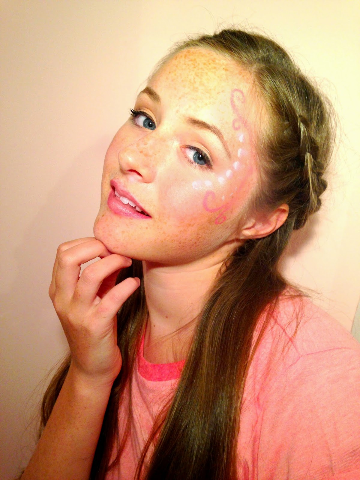

Then I added text around the photo in particular a title and subheadings to make it look like a front cover. I used a font called 'Budmo Jiggler' which looks like a dressing room mirror light and I think it goes well with the 'Pop' genre because pop stars are in the public eye. I made a slogan which is 'Making Pop the new POP-ular!' and used 'Amatics small caps' in black because i wanted to make a font family. I then used 'Emily's Candy' for the rest of the writing and used three different colours to make certain parts stand out. I added a star shape in the bottom corner to show whats in the magazine. I like the idea but not the colour or font.
First Draft:

Second Draft:
I used the same font for my title as it suits the pop industry but changed to a darker purple and made it slightly bigger. I used a different photo because I thought the pose was more interesting and I rearranged the placing of the text. I moved the slogan next to my title as it fits better. I moved my issue date under the title as it is important to the reader to see what magazine to buy. On the left side of the front cover I have kept the same text but changed the font to 'Lobster Two' as I think it easier to read and goes better with the other fonts. I have changed the font of 'Beth Tierney' as it is the name of my model/singer and want it to stand out. I kept the same bar-code but added the date above it and the price and website below to give the reader more information about 'Emerge' magazine. Next to this I added a extra bubble compared to the first draft as it looked slightly empty and need more writing. I used the same font as the rest of it but changed two words 'Pop Music' to a different to make it stand out the same as the other piece of text. I changed the font colour to black as I made the background a light pink colour and need it to be easily readable. In the bottom right corner I added a similar star shape bubble as in the first draft but changed the colour to a purple. I changed the font to 'Lobster Two' and had it in white but the word 'Exclusive'in red to show it's important. I changed the text in the star to make it more enticing.


Thursday, 11 December 2014
Questionnaire
I surveyed 15 people in the age group of 13-20 to see what they thought I need to include in my pop magazine.
I am going to write the amount of people who voted for each option in red.
1. I am making a pop magazine, what colours should I use?- Pink and Purple (10 people)
- Blue and Pink (5 people)
- Blue and Green (0 people)
- Purple and green (0 people)
- Arianne Grande (3 people)
- Miley Cyrus (7 people)
- One Direction (3 people)
- Ella Henderson (2 people)
- Celebrity Gossip (7 people)
- Fashion (7 people)
- popular trends (1 person)
4. I have made my own singer called 'Beth Tierney' and I want to include a page about her, How do I write it?
- Article (3 people)
- Interview (12 people)
5. What particular thing should I include in fashion?
- Recent fashion shows (10 people)
- fashion trends (3 people)
- celebrities fashion sense (2 people)
6. What should I include when talking about music?
- chart hits (0 people)
- top music of the year (2 people)
- music awards show (13 people)
This helped me design and make my pop magazine because I wanted to know what my target audience wanted in my magazine to make it successful.
Initial Plan for My Magazine
These are my initial plans for my front cover, contents page and double page spread. Below are some of my own drawings showing the layout of the three different pages but when it comes to editing them I will adjust/alter it to make it look like a real magazine.
Front cover
.JPG)
Contents Page
.JPG)
Double Page Spread
.JPG)
My Model/Singer Bio


Subscribe to:
Posts (Atom)